
Guide
How to tie a room together with art
Take a room’s colors from a painting you love: the wall from its quietest color, accents from its boldest. With a worked example, a tool and frame tips.
Rooms that feel finished usually have one thing in common: the colors come from somewhere. The easiest place to borrow them from is a painting you love. A good painter has already balanced the colors for you. This guide shows how to take a room’s colors from its art, with a worked example, a tool to try it on a real wall, and the frames, mats and sets that carry it through.
Why art is the place to start
Decorators often use a rough guide called the 60-30-10 rule. About 60 percent of a room’s color goes on the walls and big surfaces, 30 percent on the furniture, rugs and curtains, and 10 percent on accents. Art usually lives in that last 10 percent. That’s exactly why it can hold a room together: it’s small enough to be bold, and it can carry every other color in the room at once, the wall’s, the sofa’s and the cushions’.
It also lasts. Paint comes in thousands of colors and you can change it in a weekend. The painting you love is the thing you won’t want to replace, so it should come first, and the room should be built around it.
The method, in three steps
1. Choose the art first. Pick the painting before the paint, the rug or the cushions.
2. Take the wall from the painting’s quietest color. Look for its palest, softest color, often the sky, the paper or a shadow, and use a gentle version of it on the wall. The painting will look like it was made for the room.
3. Repeat its boldest color two or three times. A pillow, a vase, the spine of a book. Small echoes of the strongest color carry the painting across the room.
In practice: paint the walls the quiet color, the pale gray-blue taken from the sky. Keep the big furniture neutral. Then repeat the terracotta in two or three small things, a throw, a lamp base, a stack of books, and the bridge in the painting starts talking to the rest of the room.
Try it with a painting
To try this wall in other rooms, open the painting’s page, tap On a wall, choose Your own color and enter the code above.
How the tool picks: Quiet takes the painting’s palest, softest color and lightens it. Middle takes its most middle-toned color and mutes it a little. Bold takes its strongest color and deepens it. Paint chips never match a screen exactly, so take the code to a paint store, put real samples on your own wall, and look at them in daylight and again by lamplight before you choose.
Already furnished? Let the room choose the painting
Most of us aren’t about to repaint. Then run the method the other way. Stand in the doorway and name the three or four colors you see most: the walls, the sofa, the rug, the wood of the floor or the table. Look for a painting that holds at least two of them, one as a large area and one as a small touch. A gray-blue room with a rust rug wants a painting with both, a gray sea with a warm sail, say, more than a perfect match for either one. Then pick out the painting’s other strong color, the one the room doesn’t have yet, and repeat it in a cushion or a vase.
When the art is busy, keep the wall calm
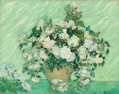
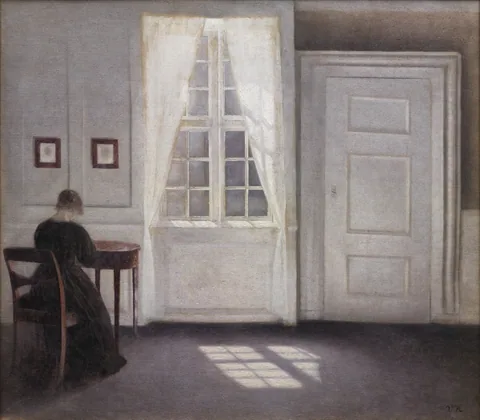
The bold wall is tempting, and it can be beautiful with a quiet painting like a Hammershøi interior or Monet’s Waterloo Bridge at sunset. With something already busy, like Van Gogh’s roses, a quiet wall lets the painting do the talking. A rough test: the more colors and movement in the picture, the paler the wall.
Warm room or cool room?
Every painting leans warm or cool overall. Golds, ochres, reds and browns are warm; blues, greens and grays are cool. Put a warm painting in a room of warm wood and cream fabrics, or a cool one with gray floors and white linen, and the room settles. Put them against each other and the painting becomes the one bright spot, which can be just as good if that’s what you want. Our shop sorts every painting by its main color: blues, greens, golds and warm tones, reds and pinks, soft neutrals and dark and moody.
More than one piece: give them something in common
Two or three paintings in a room tie it together when they share something you can see from the doorway: a color, a frame, a mat, or a subject. Color is the strongest of the four. Three different painters agree perfectly well if their palettes do.
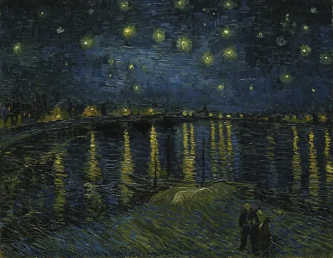
Our two color sets show it. Blue tones hangs Van Gogh’s Langlois Bridge and Starry Night Over the Rhône with Cézanne’s Mont Sainte-Victoire. Gold and amber tones hangs Constable’s Hay Wain with Brueghel’s Tower of Babel and Millet’s Gleaners, painted almost three centuries apart. Each set costs 15% less than three single prints, and you can build your own.
In an open-plan room, let one painting, or a pair, carry a color from each zone: the blue of the kitchen tiles and the rust of the living-room rug in the same picture will join the two spaces better than anything else.
Frames and mats: blend in or stand out
Black frames sharpen everything and suit most rooms, especially with dark furniture or metal. Natural oak warms a room with wood floors or pale furniture. White frames almost disappear on a white wall, which keeps every bit of attention on the art. Try each one in the tool above, and for the long version see How to choose a frame color.
A mat is a second way to bring a color in. White gives a busy painting room to breathe. A colored mat picks a color out of the picture and puts it next to the wall: French blue for the blues, Moss Point green for the greens, sauterne for golden light. Bold, graphic pieces such as Japanese woodblock prints can also go without a mat, right up to the frame. All 14 mat colors.
Questions people ask
Should the art match the sofa?
Share, don’t match. A painting with the sofa’s color somewhere in it looks chosen; a painting picked to match the sofa exactly looks as if it came with the sofa.
I rent and can’t paint. Does this still work?
Yes. Use the quiet and bold colors in what you can change: cushions, a throw, a rug, a lampshade, and a colored mat around the print itself.
Do all the paintings in a room need the same colors?
No, but each should share at least one color with the room or with another painting. That thread is what makes a mixed collection look collected.
How do I see a painting on my own wall color?
Open the painting’s page, tap On a wall, choose Your own color and enter the wall’s code. The tool above gives you codes to try.
Palettes worth borrowing
Shop by color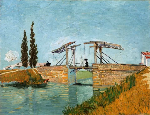


Sources
More from the Journal
 Guide · 8 min
Winter and Christmas art prints worth hanging
Snow scenes that can stay up until March, Nativity paintings for December, the sizes and frames that suit them, and when to order for Christmas. Guide · 7 min
Art as a gift: how to choose a print they’ll keep
Choose for their walls, not yours: safe sizes and frames, ideas by occasion, the gift note in the box, and how early to order for the holidays. Guide · 7 min
Art gifts for mom and dad: ideas by what they love
Art gift ideas for parents, by what they love: gardens, the sea, books, travel, home. Safe sizes, a personal line of words, and when to order for Christmas. Guide · 6 min