
Guide
How to choose a frame color: black, white, wood or gold
Frame the painting first, then the room. How black, white, wood and gold frames behave, what to do about wood floors, and when a mat helps.
A frame belongs to the painting before it belongs to the room. Choose it for the picture first, its colors, its age and how much detail it has, and then check it against the room’s floors, wood and metal. Do it in that order and the frame looks like part of the art. Do it the other way round and it looks like part of the furniture.
Rembrandt understood how much a frame does. In The Girl in a Picture Frame (1641) he painted one in: a feigned frame, only its bottom and right side visible, with the girl’s hands reaching over its edge as if she were about to lean out of the picture.
Start with the painting
Look at the darkest color in the picture and at its edges. A painting with deep shadows or a strong outline takes a dark frame easily. A pale, airy one, a watercolor or a sky full of light, can disappear inside a heavy black frame, and usually looks better in white or pale wood. Then think about its age. Old master portraits and dark, glowing landscapes look at home in gold, or in black with a gold lip.
If you want the frame to echo a color in the painting, pick a minor one: a gold frame that catches a few touches of yellow, or an espresso one that repeats a dark tree trunk. Match the main color and the frame melts into the picture.
Painters have had views on this too. Degas sketched frame designs and often chose white frames for his own work. The Impressionists chose their own frames for their first group show in 1874, a break from the largely gold-framed paintings of the official Salon. So a white frame on a Degas isn’t a modern idea at all.
Black
Black is our usual frame because it suits almost every painting and every room. It sharpens the edges of a picture, holds its own with dark furniture and metal, and pairs with a white mat for the classic gallery look. It is the safe choice for a gift and for a mixed gallery wall. We make black in a classic moulding 1.25 in wide, a slim one 0.875 in wide, a deep one that stands 1.125 in off the wall, a wide flat matte black 1.625 in across and a deep box that stands 2.25 in out. For a Japanese woodblock print like Hokusai’s Red Fuji, a slim black frame is hard to beat.
White
A white frame on a white wall almost disappears, which keeps every bit of attention on the picture. It suits bright, light paintings, beach scenes and flowers, and Scandinavian and coastal rooms. On a colored wall, a white frame stands out as a clean line, like the trim around a window. Pair it with an off-white or cream mat rather than a bright white one if the painting is old and warm, so the two whites don’t fight.
Wood
Natural oak, maple, natural wood and espresso bring warmth, and they work hardest in rooms with wood already in them. You have two good choices with wood floors or furniture. Match it closely, so the frame looks like it came from the same tree as the table. Or contrast it clearly: dark espresso against pale oak floors, pale maple against dark walnut. The one to avoid is almost-matching, a wood just a shade off the floor’s, which looks like a mistake rather than a choice. Wood suits landscapes, botanicals and relaxed rooms; the weathered driftwood frames suit coastal ones.
Gold, and the grand frames
Gold is for older paintings, portraits and anything with warm browns and candlelight in it. Vigée Le Brun’s Madame d'Aguesseau de Fresnes looks right in it. If plain gold feels too much, black with a gold lip gives the gallery look for old masters with a little more restraint. For a statement, there are the wide frames, Concerto, Plein Air and Vintage copper, from about 2.5 to 3.25 inches wide. Give them a big picture and some wall: on a small print a wide ornate frame becomes the subject. A quick test for any frame: step back across the room, and if you notice the frame before the painting, it is too much.
Floors, furniture and metal
Once the painting has narrowed the choice, the room decides between the finalists. Our rough guide:
| If the room has | Try | Why |
|---|---|---|
| Honey or oak floors | Natural oak, or black | Match the warmth, or step clearly away from it. |
| Dark wood floors or furniture | Espresso, gold, or white | Tie in with the dark wood, or lift the wall with a light frame. |
| Gray or cool floors | Black, white, driftwood gray | Cool finishes keep the room calm. |
| White walls, simple furniture | White, black, or a maple box frame | Clean lines; let the picture carry the color. |
| Brass or gold fittings | Gold, or black with a gold lip | Repeat a metal that’s already in the room. |
| Chrome, steel or black metal | Black, or black with a silver lip | Cool metal likes a dark, crisp edge. |
Should all the frames match?
On one wall, mostly yes. A group of different pictures hangs together when the frames and mats match, which is why a gallery wall in one frame color looks calm and one in many looks busy. Across a whole room, frames don’t need to match, but each finish should appear at least twice, so it looks chosen. Two black frames and two oak ones in a room is a scheme; five different finishes is a collection of accidents.
The mat
A mat is the board between the picture and the frame. It keeps the print off the acrylic, gives the picture room to breathe, and its window is cut on a bevel so it doesn’t cast a shadow on the picture. A neutral mat is the safe start, which is why ours are white unless you choose otherwise. Off-white is kinder to old, warm paintings; cream suits golden ones. A black mat is dramatic, and a white mat with a black core draws a fine dark line around the picture.
Width matters as much as color. Our mats run from 1 to 5 inches on each side, 2 inches as standard. A wider mat makes a small picture look grander and more important; a bold, graphic piece, or a big one, can go without a mat and run right to the frame. Our mats come in 14 colors: white, off-white, antique white, cream, pearl, sand, sauterne, dawn gray, french blue, silver florentine, indigo, moss point green, smooth black and white with a black core. See them all.
Frames for canvas
A canvas doesn’t need a frame, but a floating frame finishes it like a painting in a gallery: the canvas sits inside with a narrow gap all round. They come in 9 finishes, black, white, silver, gold, natural oak, walnut, natural wood, espresso and maple, and the same logic applies: black for crisp, wood for warm, gold for old paintings. Framed canvas, measured. If you are still deciding between a canvas and a framed print, our side-by-side comparison has real prices.
Questions people ask
Black or white frame?
Black for contrast and definition, white to let the picture float on a light wall. If you can’t decide, black with a white mat almost never looks wrong.
Should the frame match the wall color?
No. Match the frame to the painting and the room’s wood or metal; let the wall be the background. A frame the same color as the wall vanishes, which is only a good thing when it’s white on white. To pick art that picks up a room’s colors, see How to tie a room together with art.
Should the mat and the frame be the same color?
They can be, but contrast is easier. White in white is soft and quiet, lovely on light, airy pictures; black in black is heavy and needs a bold picture to hold it. For most paintings, a light mat in a darker frame, like the classic black frame with a white mat, or a white mat in wood, is the easy choice.
Can a modern room have a gold frame?
Yes, especially on an old painting. One gilded frame in a plain, modern room is a classic move; it reads as a deliberate contrast.
Can I see the frames on my painting first?
Yes. Every painting’s page shows the frame you choose on the picture and on a wall, and Our frames lists all 26 mouldings with their real widths and depths.
Paintings in this guide
Old masters







Sources
More from the Journal
 Guide · 8 min
Winter and Christmas art prints worth hanging
Snow scenes that can stay up until March, Nativity paintings for December, the sizes and frames that suit them, and when to order for Christmas.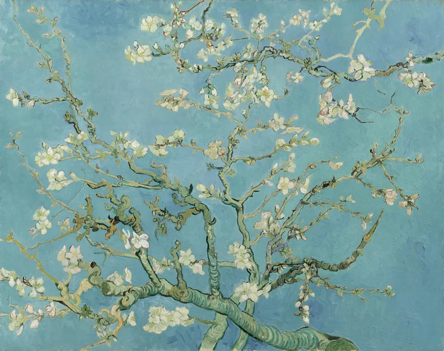 Guide · 7 min
Art as a gift: how to choose a print they’ll keep
Choose for their walls, not yours: safe sizes and frames, ideas by occasion, the gift note in the box, and how early to order for the holidays.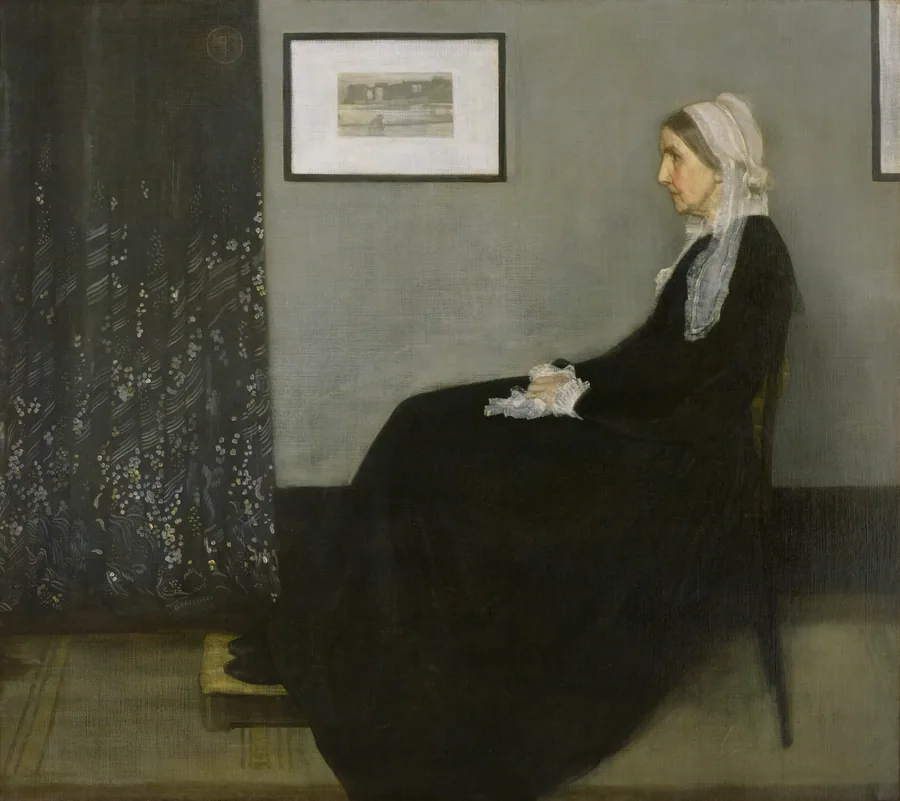 Guide · 7 min
Art gifts for mom and dad: ideas by what they love
Art gift ideas for parents, by what they love: gardens, the sea, books, travel, home. Safe sizes, a personal line of words, and when to order for Christmas. Guide · 6 min